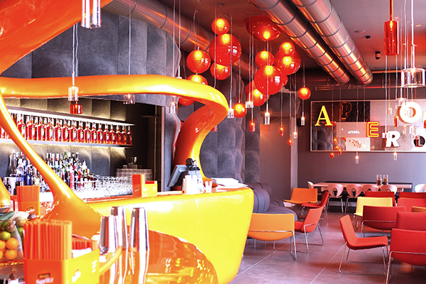

Aperol Terrace in Milan / Spillray

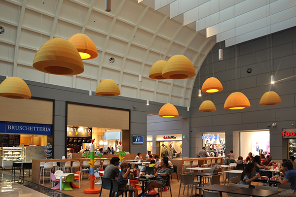
Le Rondinelle Shopping Mall / Bell

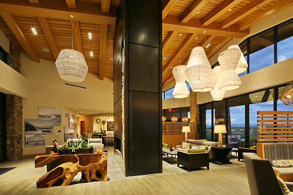
Encore Eastmark Community Center Arizona / Layers
Born near Venice, a crossroads between central European and Mediterranean influences, from the very start Axolight encapsulated the tradition of artisanship and the energy of trends from all over Europe. Its vocation and international spirit cross borders in gathering ideas and offering up its concepts.
Thanks to this eclecticism it manages to face all kinds of projects, created totally in synergy with designers like Dima Loginoff, Karim Rashid, Ryosuke Fukusada, Sandro Santantonio, Timo Ripatti, Brian Rasmussen, Manuel Vivian, Serge and Robert Cornelissen, Rainer Mutsch. They couldn’t have been realised without a 20 years’ knowledge of various materials: glass, crystal, fabric, ceramics, metal, aluminium and ABS. And it is also thanks to this eclecticism that Axolight’s products are perfect in several areas, such as residential, hospitality, and business.
The strong urge to go global over the years has been structured through direct presence in over 90 countries around the world and the creation of the two branches abroad Axolight USA and Axolight Asia, which make it possible to meet the needs of various markets with the most appropriate timing, ways and languages.
The new brand identity introduced in 2017 is the tangible proof of the company’s evolution that will allow Axolight to face the challenges of the future’s consumers, ever more demanding and prepared. The new image is created by Teikna Design, specialised graphic design and branding studio with offices in Milan, founded and directed by Claudia Neri. Teikna Design was asked to radically revamp the image that would reflect the profound change that the company is going through: “Since this new look wasn’t going to be just superficial, we had to go way back,” says Claudia Neri. “Our inspiration was born thinking about one of design’s heydays, the so-called mid-century modern, that is, 1950s and 1960s design, straying into the 1970s a bit, too. An assertive design made up of strong shapes, bright colours and decorations. An era when people looked boldly and enthusiastically to the future: a sentiment that has truly guided the Axolight project. I work ed on primary geometries derived from the shape of the letters A, X and O that morph to the point of becoming abstract; from the alphabet they go back to being pure geometry.” The claim that identifies and distinguishes the new image is Bespoke Design that, as Claudia Neri reveals, “in Axolight’s case is a key factor in which the business skills and the approach to the project allow you not only to adapt the products to the market’s needs, but also to manage to interpret the look so that it is tailor-made – and so, bespoke.”

